 Australia
 Austria
 Belgium (Dutch)
 Canada (English)
 Denmark
 Estonia
 Finland
 France
 Germany
 Ireland
 Italy
Italy
 Luxembourg (French)
 Netherlands
 New Zealand
 Norway
 Poland
 Portugal
 Romania
 Singapore
 Spain
Spain
 Sweden
 Switzerland (French)
 USA
USA
 United Kingdom
 Other Countries


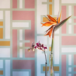
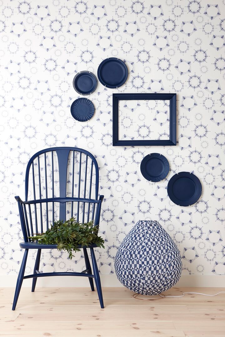
Blend the old and new
Originating from pantones prevalent in period properties, this trend allows you to introduce a touch of stately home into your interior. The inky trend gives you the perfect opportunity to blend the old and the new without redefining your home based around a particular period in time. Mix patterns such as stripes, which are a current trend in the fashion world, with inky blues and brass accents like photo frames, trinkets and lampshades to create a pleasant feeling of old and new, which blend together to create a modern, slick look inspired by olde-worlde home décor trends.
Petrol hues & mysterious blues
Shades of paint that evoke a sense of mystery, such as deep petrol hues, can create a dramatic effect in your space. The darker the hue, the more you have to try and consider how it will impact your room. Create a super-stylish living space by pairing dark, dramatic colours and beautiful bold feature accessories that will simultaneously lift the lightness of your room. Try channelling an alternative feature wall by using shelving to create a space for your photographs and artwork. Introducing a key blue piece can also add to the personality of a room – luxurious dark velvet sofas in your living room create a statement centrepiece for you to work around with different interior design styles.
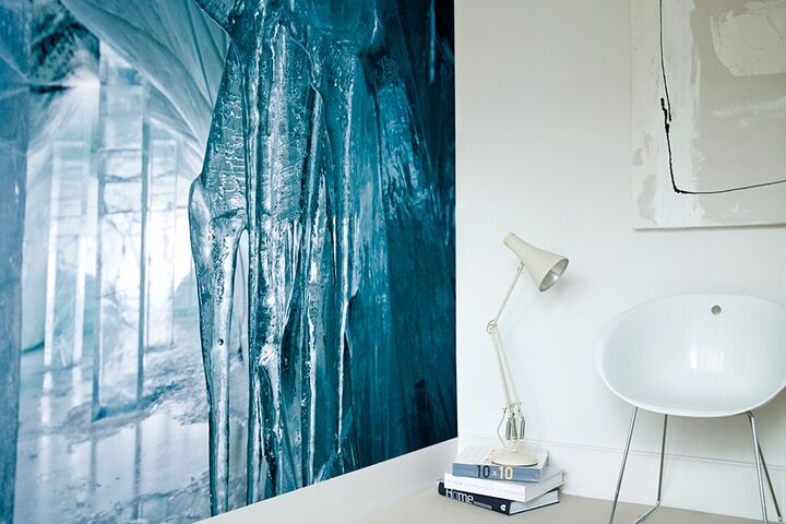
Return to the River by Icehotel
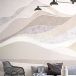
Light hues lighten your mood
Lighten the mood by pairing dark tones with cool neutral accessories. Use key Scandi design methodologies by mixing dark and light harmoniously – chalky whites and dove greys, as well as natural wood and stone, pair up perfectly to create a well put-together contrast. Be strategic about how you use your colour palettes – juxtaposing colours can give a luxe feel to your home but getting the balance right is key. The starkness of an inky blue kitchen mixed with the purity of an all-white tiled wall adds a sense of sleekness to your interior. Pattern and print can also be a fabulous way of creating contrast if you’re in fear of darkening your space a little too much. Reverse the flow and accessories using dark elements – photo frames and painted furniture mixed with dark fabrics can all be part of the beautiful ambience you create in this room.
Before you give your interior space an overhaul, try and make a mood board to help you visualise the end result. If you’re not completely sold on this bold colour blocking trend, try your hand with beautiful illustrative patterns and accessories with dark colour swatches.
How will you be introducing the Inky Interiors trend into your home?