


Gray is an intermediate color between black and white. It is considered a neutral color or achromatic color. Achromatic literally means “without color”. Many things are associated with the color such as cloudy sky, ash and lead. It is a color of compromise as it is neither black nor white and considered to be the transition between two non-colors. The closer the color gray gets to black, the shade is considered to become more dramatic and mysterious. On the other hand, the closer it gets to white, the more lively and illuminating the color becomes.
In interior design, many homeowners avoid the use of gray in their homes since many believe that the color is dull and boring. However, gray has many different shades that can be used in the rooms that can create a mood or atmosphere that many will love. You can treat gray as a neutral color and be used as a base where you can complement it with other colors as accents. You will be surprised how versatile the color is in your home and can transform dull rooms into vibrant and lovely ones.
The significance of color gray
In color psychology, gray is described as motionless and emotionless. The color creates a sense of calm and composure, bringing you farther from the stresses of the real world. It is a quiet and reserved color and does not stimulate, energize or excite, as compared with warm colors.
In interpreting the color gray, it is conservative, boring, and depressing, but elegant, formal and glamorous. However, overuse of the color can create a sad and depressing mood and has the tendency to loneliness and isolation. These are the reasons why adding other colors with gray can change these moods into their opposites.
Gray is believed to represent indecisiveness as it tends to sit in the middle and not making any decision. The color can also appear indifferent, cold and aloof, as well as it has the tendency to depress energy. However, gray is considered to be a stable base from which new and positive can come.
The different nuances of gray that can be smart choices for your rooms
In general, there are two variations of gray: light gray and dark gray. Light gray is considered to be soothing and calming. It is believed to enlighten, save and rescue those who are in difficult life situations. Dark gray, on the other hand, is conventional and constrained. It is considered to be serious and solemn. The shade is associated with self denial and self discipline.
Here are some nuances of gray that you may use in your rooms:
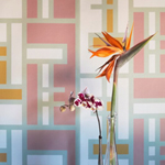
1. Outdoor look – being inspired by nature, a simple gray, white and blue palette keeps the room connected to nature. This palette has a balance between warm and cool colors.
2. Color for teenage boys – many individuals love blue, but the color is so basic and common. Gray, on the other hand, can add a masculine touch that looks and feels appropriate at any age. You can use gray wallpaper on walls and soft gray paint on the ceiling of the room so as to create a neutral and cozy space.
3. Serene – with the use of multiple shades of gray, you can successfully achieve creating a masculine, clubby sanctuary for the homeowner. Pair the shades of gray with taupe, camel and cream to create a peaceful yet interesting atmosphere.
4. Art display – commonly, white is used as a background in hanging art. The use of warm gray creates a great backdrop for everything from bold contemporary art works to classic ones.
5. Intimate – in many rooms, the use of earth tones can create a warm and cozy atmosphere. In addition to earth tones, carbon dust, a nuance of gray, can create a space which feels more private , warm and calming.

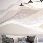
6. Soft touch – it is recommended to use a selection of richly textured neutrals in a room filled with bold architectural elements. Use soft taupe-paint with muted palette to create a soothing and calming atmosphere in a room.
7. Glamorous gray – as mentioned earlier, gray is a versatile color. The different shades of gray can create a calming and inviting atmosphere as well as a soothing a sophisticated space.
8. Striking tone – today, gray is used everywhere. The dilemma is which gray to choose and use in your space. Actually, the tone and shade of gray to use depends on the other colors that you will be incorporating in the room. For instance, a steel gray blends well with saturated shades of the fabric.
9. Sweet and subtle – soft gray walls and crisp, light neutrals create a modern and luxurious feeling for the home interior.
10. Classic modern – white colored furniture pieces appear striking and modern against walls painted with pale gray. These are further emphasized when fabric with citrine accents and oversized patterns are used.